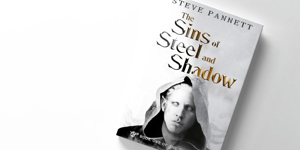
As well as writing fantasy fiction novels, I’m also a multidisciplinary designer – which is a fancy way of saying that I trained as a graphic designer back in 2010 and, since then, I’ve worked across a gamut of roles in the creative industry. This skillset/experience means that I’m comfortable in designing for one of my favourite applications…the book cover! In this post, I’ll take you through a run-through of how I designed the book cover for my gritty fantasy book, The Sins of Steel and Shadow.
The design brief
Like any creative project, it all starts with the design brief. This is never an outline of what should happen, but instead it should clearly state the intended outcome, as well as any parameters there are (and how flexible they might be).
For this project, I was my own client, but I obviously set myself some demands so that I could stay focused and on track. My three key requirements were:
- The cover needs to clearly indicate the style and genre (gritty fantasy fiction) – I want readers to have an idea of the kind of story it will be, just from the cover
- The cover must have stand-out – I don’t want it to blend in with other books in the genre. It needs to capture interest.
- The cover must work as both the print and ebook variants – any design should work for a 5×8″ printed cover and a digital thumbnail
Other than that, the world was my oyster. Obviously, I needed to do the basics – things like ensuring the title (and author name) were legible and clear, and making sure any typefaces or third-party imagery was properly licensed for the job at hand – but outside of that, I didn’t want to limit my creative scope.
I also have one additional firm line when it comes to (any) book cover design: no AI-generated artwork.
The research
Any designer worth their salt will tell you that research is a foundational part of any project. For book cover design, this typically entails two approaches that I take silmultaneously:
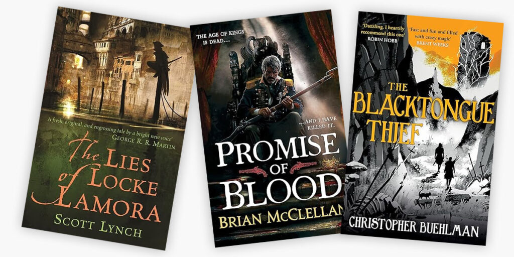
- I’ll look at the genre/category – what other covers are appearing on the market? Which ones are showing signs of success? Which ones push and stretch things from a creative perspective?
- I’ll research based on my initial ideas – this means looking at stuff outside of book covers. Architecture, sculpture, art, illustration, typography, 3D design, poster design, editorial design, photography, even nature itself! I’m a sponge when it comes to actively observing stuff that exists outside of my field of play – you never know when it might spark some inspiration!
For The Sins of Steel and Shadow, this meant taking a look at the fantasy fiction genre. Or, more specifically, books that exist in a grittier/darker space than the likes of epic fantasy.
In addition to this research, I also decided early-on that I wanted to feature a character on the cover of this book. I purposefully avoided it with my debut release, The Hunter’s Lament, but I felt that readers in my chosen genre respond better to cleverly-executed character artwork.
Initially, I explored the idea of putting a figure in one of the book’s main settings, either through traditional or digital painting. However, another idea came to mind when I found myself browsing the world of classical sculpture.


The idea
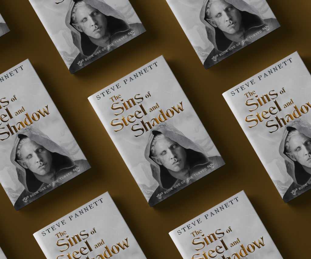
It was this latter idea that eventually won out. I really liked the idea of featuring a primary character, depicted as a classical-era statue. The fact that the statue could convey a mood, both through the subject’s expression (serious/grim) and the state of the sculpture itself (chipped/broken) was appealing. I liked the fact that it would lend itself well to a light cover design overall (an almost greyscale palette would give me standout in the genre for sure) and I liked the fact that I had options for how to execute it. It could be a digital painting, or photo-manipulation (“photo-bashing”) or even a traditional media like graphite illustration that I could then pull into a digital setting for treatment.
In my initial sketches of the cover, I also enjoyed the fact that it would allow plenty of real estate for the book’s title – which is super important for the ebook version – and I realised that I could add subtle details that might not be noticeable on the first glance. These kind of things provide what I call “surprise and delight” moments for a consumer, who might only pick up on them once their initial interest has been piqued.
The execution
So, with my idea in mind and my client (again, this was also me) happy to proceed, I set about working up several different executions of how I might realise this vision.
Primary cover art
Initially, I reached out to some 3D artists, as my own skillset with the likes of Blender were far too limited to achieve what I was looking for. However, despite having some budget for this, I quickly realised that—right now at least—this wasn’t a viable route forwards for this book. Instead I investigated something that I’m more au fait with: photo-manipulation.
Using a mixture of licensed stock photography and open source imagery, I quickly assembled a viable layout for the character artwork, collaging several shots together (a cloak, my primary figure and then several facial features that I wanted to replace) – a quick Google search then provided me with a bunch of great tutorials on how to turn things into stone (Medusa-style) in Adobe Photoshop.
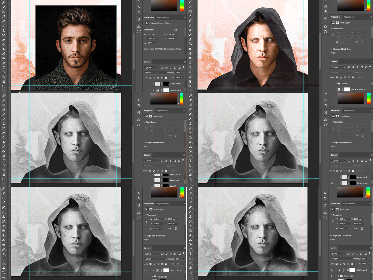
With my primary cover art coming along nicely, I then sourced an interesting, textured background that gives the impression of smoke or mist (suggesting danger and/or mystery, all part of the overall feeling of the book) and applied it to the full jacket (front cover, spine and back cover combined). This was merged with the primary art, I was ready to start working with type.
Typography
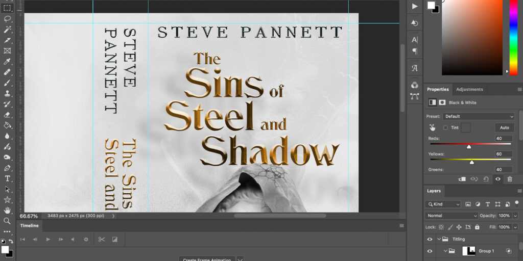
Typography is a hugely underrated aspect of book cover design – I’ve seen some wonderful cover artwork completely ruined by a lacklustre, or downright hideous typographic accompaniment. This is because most people aren’t as big a type-nerd as most designers are, which might not seem all that important until you realise that this is what provides designers with that most controversial part of their expertise: taste.
Taste in design, but specifically in typography, comes with an intimate understanding of how much craft goes into the work. It also comes with an in-built system that throws up red flags whenever we see warning signs in a typeface. Some fonts simply aren’t strong enough. Others are too twee or objectively not fit for purpose. One of the big ones for me is disliking a particular character in a typeface’s repertoire. If I see a lowercase “g” that I know I will hate, then that particular typeface is unlikely to make it through my vetting process (one exception to this rule is if I’m using a typeface for a specific word-marque, such as the title of a book, and this character will play no part in it).
And even once you’ve picked the perfect typeface (and made sure it’s licensed properly, too) there’s then the question of how to apply it. For The Sins of Steel and Shadow I knew that I wanted some type treatments that gave the title a bit of heft, as well as distressing it in a way that didn’t look hokey or forced. This wasn’t a personal preference, but something that I knew had to happen in order to ground the book in the gritty fantasy genre, as well as ensure it could be read at small scales.
With my type treatment complete, I could pull all of the elements together and start playing with the final composition itself.
The final design
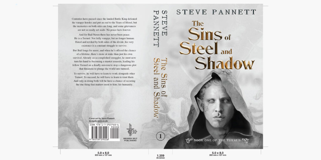
The final cover for The Sins of Steel and Shadow has five key elements:
- The title of the book
- The author name
- The series indication
- The primary artwork
- The background
For any design to work, all of these elements need to work together, holistically contributing to the final cover. They also need a clear visual hierarchy, ensuring that casual browsers will pick up on the most important things first (in this case, the title of the book and the primary artwork, which gives a sense of mood and style). For this book cover, that meant producing several variations that would allow me to pick my preferred route to the finish line. Some had the author name at the top, others at the bottom. Others altered the type treatment of the book’s title. More still removed the series indicator entirely, relegating it to a position on the spine alone.
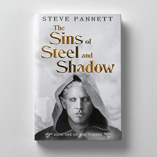
All in all, this appetite for exploration allowed me to comfortably land on the perfect cover for The Sins of Steel and Shadow.
📚✌🏻SP
Share this post

Book One of the TURNED
The Sins of Steel and Shadow
Hated and reviled by humans and vampyrs alike, every day for a Turned is a deadly struggle. But when Bail is offered the chance of a lifetime, there’s much more at stake than just his survival.
The Turned series is a fast-paced, character-led, gritty fantasy saga for fans of Joe Abercrombie or Scott Lynch.
Steve Pannett is an author and designer based in Yorkshire, UK.
He writes primarily in the fantasy genre, combining character-led storytelling with epic, gritty world-building to create dark tales with plenty of action and lots of twists along the way.
He has self-published multiple books and is active online.
